 +994512060920


Imagine a visitor who can't use a mouse. Maybe their hand is injured, or they have a motor impairment. Or a visitor who can't see the screen and listens to the page through a screen reader. Or someone with color blindness who can't tell red from green. Could these users place an order on your site, fill in a form, or check a price?
On many sites the answer is "no," and the business often doesn't know it. The site looks great to the designer and the developer, and testing was done on their own devices with their own abilities. Web accessibility exists to close this gap. In this article we'll explain what it is, which standards it rests on, and which concrete steps to take on your site.
What Is Web Accessibility?
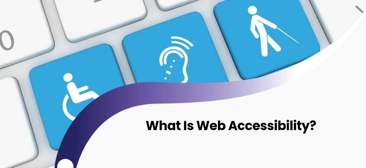
Web accessibility means a website can be used by as many people as possible. That includes people with different needs related to vision, hearing, movement and cognition. It also includes temporary and situational cases: someone with an arm in a cast, someone looking at a phone in bright sunlight, someone who can't turn the sound on in a public place.
Accessibility is not an "extra feature for a special group." It means a properly built site is easier for everyone.
What Is WCAG?
The international standard for accessibility is WCAG (Web Content Accessibility Guidelines), published by the W3C. The latest version is WCAG 2.2. The standard is built on four principles, known together as POUR:
- Perceivable: information must be presented in a form users can sense. For example, an image needs a text alternative.
- Operable: the site must work with a keyboard and other input methods.
- Understandable: text and the interface must be clear, and errors must be explained in a way people can follow.
- Robust: the site must work correctly across different browsers and assistive technologies.
The Three Conformance Levels
| Level | Meaning |
|---|---|
| A | The minimum level. Removes the basic barriers that assistive technologies can't work around on their own. |
| AA | Everything in level A plus additional requirements. Some may need more work and design changes. |
| AAA | The highest level. It may not be possible to meet some requirements for all content. |
For most sites the target is level AA. In practice, the first goal is simple: move your site closer to AA.
What's New in WCAG 2.2?
According to the W3C, WCAG 2.2 added nine new success criteria and removed the old 4.1.1 Parsing criterion. The main AA-level additions are:
- Focus Not Obscured (Minimum): an element focused by keyboard must not be fully hidden behind another element, such as a sticky header or a cookie banner.
- Dragging Movements: anything done by dragging must have a non-dragging alternative.
- Target Size (Minimum): clickable elements should be at least 24 x 24 CSS pixels. There are exceptions for spacing and other cases.
- Accessible Authentication (Minimum): logging in must not require a demanding cognitive test, such as a memory-based puzzle.
At level A, Consistent Help (the help mechanism sits in the same place across pages) and Redundant Entry (the same information isn't requested again and again) were added.
The Most Common Accessibility Problems on Websites
1. Color contrast
Light gray text on a gray background looks elegant in a design, but many people can't read it. WCAG 1.4.3 requires, at level AA, a contrast ratio of at least 4.5:1 for normal text and 3:1 for large text. Large text means 18 pt, or 14 pt bold (roughly 24 and 18.5 pixels). The ratio is not rounded: 4.499:1 does not pass. Logotype text and disabled buttons are exceptions.
2. Images without alt text
A screen reader can't see an image. It reads only the alt text. A product photo, a logo or an informative chart needs a short, meaningful description. Purely decorative images should have empty alt text so the screen reader skips them. Alt text is also a good habit for site performance and SEO.
3. A site that can't be used with a keyboard
People who can't use a mouse move around with Tab, Enter and the arrow keys. If a menu opens only on hover, or buttons are built from div elements, these users can't use the site. Every interactive element must be reachable by keyboard, activatable, and show visible focus. Don't design it so that the focus outline is removed entirely.
4. Forms without labels
Fields marked only with a placeholder lose their hint once the user starts typing, and they aren't clear to screen readers. Every field needs its own visible label. Error messages should be explained in text, not only in red. For example: "The phone number format is wrong. Example: 050 123 45 67."
5. Relying on color alone
Information like "required fields are red" or "successful payment is green" is lost on people with color blindness. Always add text, an icon or another indicator to color.
6. A broken heading structure
Headings (H1, H2, H3) should show the structure of the content, not just change the font size. Screen reader users often navigate a page by its headings. A correct heading structure helps them and also helps search engines.
7. Vague link text
"Read more" and "Click here" mean nothing out of context. A link like "more about mobile app pricing" is clear to a screen reader user and to a search engine.
8. Videos and audio without captions
Providing subtitles for video and transcripts for audio matters for users with hearing difficulties and for those who can't turn the sound on.
9. Click targets that are too small
On mobile, tiny buttons packed together are a problem for people with hand tremors or larger fingers. The Target Size criterion in WCAG 2.2 addresses this with a 24 x 24 CSS pixel minimum.
10. A missing language attribute
The page language should be declared correctly in the HTML. This helps screen readers pronounce the text correctly. On multilingual sites, each language version needs its own language code.
Core Rules for an Accessible Site
- Use standard HTML elements first. button for buttons, a for links, h1 to h6 for headings, ul and ol for lists. Browsers and assistive technologies already recognize these correctly. ARIA attributes are needed only when a standard element isn't enough.
- Put a "skip to main content" link at the top of the page. Keyboard users shouldn't have to Tab through a long menu on every page.
- Allow text to be enlarged. The design must not break when users increase the text size.
- Limit autoplaying video, audio and moving banners, or give users a way to stop them.
- Manage focus correctly in modals and dropdown menus. When a window opens, focus should move into it, and when it closes, focus should return.
- Warn users about time limits on operations and let them extend the time.
E-commerce and Payment Pages
The business impact of accessibility shows most on sales pages. If the cart, the address form and the payment step aren't accessible, users can't complete an order. On these steps, labels, error messages, keyboard navigation and focus management matter especially. The Redundant Entry and Accessible Authentication criteria in WCAG 2.2 apply to exactly these flows. When you set up online payment, plan the accessibility of the interface too. Other ways to grow sales are in our article on increasing sales with an e-commerce website.
How to Check Accessibility
An accessibility check happens on three layers:
- Automated tools: tools like Lighthouse, axe and WAVE find basic mistakes such as contrast, alt text and labels. But they don't catch everything. For example, a tool can't tell whether alt text is actually meaningful.
- Keyboard test: Put the mouse aside and move through the whole site with the Tab key. Can you reach every element, see the focus, and complete every action?
- Screen reader test: Go through the main user scenario with tools like NVDA (Windows), VoiceOver (Mac and iPhone) and TalkBack (Android). Ideally, also test with real users who have disabilities.
The Legal Side
In some countries accessibility is required by law. For example, the European Accessibility Act has applied since 28 June 2025 and covers e-commerce services, consumer banking services and a number of other products and services. According to one law-firm summary, it exempts microenterprises (fewer than 10 employees and under 2 million euros in turnover) from some requirements. Penalties are set by individual Member States.
If you sell to Europe or have European customers, this may apply to you. For your specific situation, consult a legal advisor. This article is not legal advice. For requirements under Azerbaijani law, you also need to check official sources and consult a specialist.
Accessibility and Business Benefits
- A wider audience: you don't lose people who can't use your site.
- Better user experience: clear labels, good contrast and simple navigation help everyone. This is also a core principle of UI/UX design.
- Overlap with SEO: a correct heading structure, alt text, clear link text and semantic HTML are useful for search engines too.
- Lower legal risk: especially for companies entering the European market.
- Brand image: an accessible site shows respect for the user.
The Most Common Mistakes
- "Adding" accessibility at the end: fixing it after design and architecture are done is always more expensive. Plan it from the start.
- Trusting ready-made "accessibility plugins": a widget placed on top of the site usually doesn't fix problems in the underlying code.
- Testing only with automated tools: tools find only part of the problems.
- Using a placeholder instead of a label.
- Removing the focus outline: leaving keyboard users without navigation for the sake of design.
- Forgetting mobile: tiny click targets and actions that require swiping.
- Checking once and forgetting: the check should be repeated as new pages and features are added.
How to Get Started
- Choose the most important pages: the home page, a product or service page, the contact form, the cart and checkout.
- Run an initial check with an automated tool and fix the most serious issues (contrast, alt text, labels).
- Walk through the main scenarios using only the keyboard.
- Test at least one main path with a screen reader.
- Write rules for color, button size and focus style into your design system so new pages comply automatically.
- Add an accessibility check to the acceptance criteria before releasing new features.
- Set a target level (for example, WCAG 2.2 AA) and re-check periodically.
If your project is at the redesign or new-system stage, including accessibility in the initial requirements is the cheapest route. These decisions are usually made in the planning phase of custom software projects.
Frequently Asked Questions
Is accessibility only for people with disabilities?
No. It also helps people with temporary limitations, older users, and people using the site in difficult conditions (bright light, a noisy environment). The real goal is to make the site work for as many people as possible.
Which WCAG level should I aim for?
Level AA is recommended for most sites. Level A is the minimum, and AAA may not be possible for all content.
Are accessibility plugins enough?
Usually not. A plugin can add an extra interface, but it often doesn't fix structural problems in the underlying code. Correct HTML and design are the main path.
Does accessibility make a site more expensive?
When planned from the start, the cost is relatively small. Fixing a finished site afterwards takes more work.
Does accessibility help SEO?
Some areas overlap: heading structure, alt text, clear link text and semantic HTML. But accessibility is not the only factor in rankings, and results can't be promised.
How do I know whether my site is accessible?
Check it with automated tools, with a keyboard and with a screen reader. If you can, also test with users who have disabilities.
Conclusion
Web accessibility means making a site work for everyone. WCAG gives a clear framework for it, and for most sites the realistic target is level AA. Simple steps like contrast, alt text, keyboard use, proper forms and a clear structure remove most of the problems. What matters most is to think about it at the start of a project and to re-check as new pages are added.
If you want to review your site's accessibility, or include accessibility in the requirements of a new project, get in touch with the Crocusoft team. Let's go through your key pages together and set the priorities.